Thursday, 9 November 2017

10 essential resource sites for web designers


As you may have noticed, not least by typing something into Google and it gleefully revealing that there are 26 million results for your search, there are quite a few websites out there. Unless you’re some kind of immortal, you won’t have time to check out many of them, even in a relatively niche area such as web design. Therefore, we’ve racked our brains to come up with a list of 21 essential sites every web designer should bookmark, unless they’re some kind of idiot—and that’s not you, is it?
1. A List Apart
An online magazine that’s so entrenched in the consciousness of web designers that it’s probably illegal if you don’t read every new issue. With hundreds of incisive articles from the industry’s very best, A List Apart should be your first port of call for in-depth insight and analysis into code, content and design.
2. 24 Ways     
Describing itself as an “advent calendar for web geeks”, 24 ways has since 2005 provided two-dozen web-design articles every December. Topics are varied, but because the contributors are first-rate, even many of the earliest articles remain useful and relevant—24 ways isn’t just for Christmas, you know.
3. Smashing Magazine
Founded in 2006, Smashing Magazine fires web design and development techniques into your brain by way of news, opinion pieces and practical tutorials. It’s also quite fond of lists, making it a handy site for discovering additional resources.
4. siteInspire
5. UX Movement
With UX increasingly a big concern within web design, it pays to keep informed. UX Movement is a blog dedicated to working with UX, providing insight into wireframing and usability concerns relating to forms, hover components and other web-page elements.
6. Search Engine Land
Building a great website isn’t much use if no-one can find it. Search Engine Land provides news about search marketing and search engines, offering hints and tips at boosting your SEO. For securing your position on Google, also check out Google Webmaster Central.
7. W3C
Most web designers will never need to know all the ins and outs that govern web standards, but the W3C website remains an essential place to visit. Not only does it provide access to specifications (including explanations and examples), but it also offers tools such as mark-up and CSS validators.
8. HTML5 Boilerplate

Most projects begin with the same kinds of files, and designers often waste time recreating them from scratch. With HTML5 Boilerplate you can get a head-start with a robust and future-proof HTML/CSS/JavaScript template. HTML5 Reset is another project along similar lines.


9. Dive into HTML5
If you need to get to grips with HTML5, Mark Pilgrim’s book offers excellent commentary on a number of features from the specification. The book is online in its entirety under the CC-BY-3.0 License, but buy a hardcopy if you use the site regularly.
10. CSS3.info
Of late, browsers have become immersed in a battle for supremacy over support for advanced CSS. To that end, the standard is evolving remarkably quickly. CSS3.info enables you to keep track of developments, learn more about properties and modules, and test a browser against CSS selectors.

Html tutorials Overview

HTML - Overview
HTML stands for Hypertext Markup Language, and it is the most widely used
language to write Web Pages.
 Hypertext refers to the way in which Web pages (HTML documents) are
linked together. Thus the link available on a webpage are called
Hypertext.
 As its name suggests, HTML is a Markup Language which means you
use HTML to simply "mark up" a text document with tags that tell a
Web browser how to structure it to display.
Originally, HTML was developed with the intent of defining the structure of
documents like headings, paragraphs, lists, and so forth to facilitate the
sharing of scientific information between researchers.
Now, HTML is being widely used to format web pages with the help of different
tags available in HTML.
Basic HTML Document
In its simplest form, following is an example of an HTML document:
<!DOCTYPE html>
<html>
<head>
<title>This is document title</title>
</head>
<body>
<h1>This is a heading</h1>
<p>Document content goes here.....</p>
</body>
</html>

Wednesday, 8 November 2017

HTML TAGS

HTML is a markup language and makes use of various tags to
format the content. These tags are enclosed within angle braces <Tag Name>.
Except few tags, most of the tags have their corresponding closing tags. For
example <html> has its closing tag </html> and <body> tag has its closing
tag </body> tag etc.

Above example of HTML document uses following tags:
Tag Description

<!DOCTYPE...> This tag defines the document type and HTML version.

<html> This tag encloses the complete HTML document and mainly
comprises of document header which is represented by

<head>...</head> and document body which is represented
by <body>...</body> tags.

<head> This tag represents the document's header which can keep
other HTML tags like <title>, <link> etc.

<title> The <title> tag is used inside the <head> tag to mention the
document title.

<body> This tag represents the document's body which keeps other
HTML tags like <h1>, <div>, <p> etc.
HTML Tutorial
19

<h1> This tag represents the heading.

<p> This tag represents a paragraph.

Sunday, 22 October 2017

Web Development Technologies

1. Browsers

Browsers are the interpreters of the web. They request information and then when they receive it, they show us on the page in a format we can see and understand.
  • Google Chrome - Currently, the most popular browser brought to you by Google
  • Safari - Apple’s web browser
  • Firefox - Open-source browser supported by the Mozilla Foundation
  • Internet Explorer - Microsoft’s browser. You will most often hear web developers complain about this one.

2. HTML

HTML is a markup language. It provides the structure of a website so that web browsers know what to show.

3. CSS

CSS is a Cascading Style Sheet. CSS let’s web designers change colors, fonts, animations, and transitions on the web. They make the web look good.
  • LESS - a CSS pre-compiler to make working with CSS easier and add functionality
  • SASS - a CSS pre-compiler to make working with CSS easier and add functionality

4. Programming Languages

Programming languages are ways to communicate to computers and tell them what to do. There are many different programming languages just like there are many different lingual languages (English, Spanish, French, Chinese, etc). One is not better than the other. Developers typically are just proficient at a couple so they promote those more than others. Below are just some of the languages and links to their homepages
  • Javascript - used by all web browsers, Meteor, and lots of other frameworks
  • Coffeescript - is a kind of “dialect” of javascript. It is viewed as simpler and easier on your eyes as a developer but it complies (converts) back into javascript
  • Python -used by the Django framework and used in a lot of mathematical calculations
  • Ruby - used by the Ruby on Rails framework
  • PHP - used by Wordpress
  • Go - newer language, built for speed.
  • Objective-C - the programming language behind iOS (your iPhone), lead by Apple
  • Swift - Apple’s newest programming language
  • Java - Used by Android (Google) and a lot of desktop applications.

5. Frameworks

Frameworks are built to make building and working with programming languages easier. Frameworks typically take all the difficult, repetitive tasks in setting up a new web application and either does them for you or make them very easy for you to do.
  • Meteor - a full-stack (front and back end) javascript framework
  • Node.js - a server-side javascript framework
  • Ruby on Rails - a full-stack framework built using ruby
  • Django - a full-stack framework built using python
  • Ionic - a mobile framework
  • Phonegap / Cordova - a mobile framework that exposes native api’s of iOS and Android for use when writing javascript
  • Bootstrap - a UI (user interface) framework for building with HTML/CSS/Javascript
  • Foundation - a UI framework for building with HTML/CSS/Javascript
  • Wordpress - a CMS (content management system) built on PHP. Currently, about 20% of all websites run on this framework
  • Drupal - a CMS framework built using PHP.
  • .NET - a full-stack framework built by Microsoft
  • Angular.js - a front-end javascript framework.
  • Ember.js - a front-end javascript framework.
  • Backbone.js - a front-end javascript framework.

6. Libraries 

Libraries are groupings of code snippets to enable a large amount of functionality without having to write it all by yourself. Libraries typically also go through the trouble to make sure the code is efficient and works well across browsers and devices (not always the case, but typically they do).
  • jQuery
  • Underscore

7. Databases

Databases are where all your data is stored. It’s like a bunch of filing cabinets with folders filled with files. Databases come mainly in two flavors: SQL and NoSQL. SQL provides more structure which helps with making sure all the data is correct and validated. NoSQL provides a lot of flexibility for building and maintaining applications.
  • MongoDB - is an open-sourced NoSQL database and is currently the only database supported by Meteor.
  • Redis - is the most popular key-value store. It is lighting fast for retrieving data but doesn’t allow for much depth in the data storage.
  • PostgreSQL - is a popular open-sourced SQL database.
  • MySQL - is another popular open-sourced SQL database. MySQL is used in Wordpress websites.
  • Oracle - is an enterprise SQL database.
  • SQL Server - is an SQL server manager created by Microsoft.

8. Client (or Client-side)

A client is one user of an application. It’s you and me when we visit http://google.com. Client’s can be desktop computers, tablets, or mobile devices. There are typically multiple clients interacting with the same application stored on a server.

9. Server (or Server-side)

A server is where the application code is typically stored. Requests are made to the server from clients, and the server will gather the appropriate information and respond to those requests.

10. Front-end

The front-end is comprised of HTML, CSS, and Javascript. This is how and where the website is shown to users.

11. Back-end

The back-end is comprised of your server and database. It’s the place where functions, methods, and data manipulation happens that you don’t want the clients to see.

12. Protocols

Protocols are standardized instructions for how to pass information back and forth between computers and devices.
  • HTTP - This protocol is how each website gets to your browser. Whenever you type a website like “http://google.com” this protocol requests the website from google’s server and then receives a response with the HTML, CSS, and javascript of the website.
  • DDP - is a new protocol created in connection with Meteor. The DDP protocol uses websockets to create a consistent connection between the client and the server. This constant connection lets websites and data on those websites update in real-time without refreshing your browser.
  • REST - is a protocol mainly used for API’s. It has standard methods like GET, POST, and PUT that let information be exchanged between applications.

13. API

An API is an application programming interface. It is created by the developer of an application to allow other developers to use some of the application’s functionality without sharing code. Developers expose “end points” which are like inputs and outputs of the application. Using an API can control access with API keys. Examples of good API’s are those created by Facebook, Twitter, and Google for their web services.

14. Data formats

Data formats are the structure of how data is stored.
  • JSON - is quickly becoming the most popular data format
  • XML - was the main data format early in the web days and predominantly used by Microsoft systems
  • CSV - is data formatted by commas. Excel data is typically formatted this way.

Web animations

The popularity of websites that allow members to upload their own movies for others to view has created a growing community of amateur computer animators.[48] With utilities and programs often included free with modern operating systems, many users can make their own animated movies and shorts. Several free and open source animation software applications exist as well. The ease at which these animations can be distributed has attracted professional animation talent also. Companies such as PowToon and GoAnimateattempt to bridged the gap by giving amateurs access to professional animations as clip art.
The oldest (most backward compatible) web-based animations are in the animated GIF format, which can be uploaded and seen on the web easily.[49] However, the raster graphicsformat of GIF animations slows the download and frame rate, especially with larger screen sizes. The growing demand for higher quality web-based animations was met by a vector graphics alternative that relied on the use of a plugin. For decades, Flash animations were the most popular format, until the web development community abandoned support for the Flash player plugin. Web browsers on mobile devices and mobile operating systems never fully supported the Flash plugin.
By this time, internet bandwidth and download speeds increased, making raster graphic animations more convenient. Some of the more complex vector graphic animations had a slower frame rate due to complex rendering than some of the raster graphic alternatives. Many of the GIF and Flash animations were already converted to digital video formats, which were compatible with mobile devices and reduced file sizes via video compression technology. However, compatibility was still problematic as some of the popular video formats such as Apple's QuickTime and Microsoft Silverlight required plugins. YouTube, the most popular video viewing website, was also relying on the Flash plugin to deliver digital video in the Flash Video format.
The latest alternatives are HTML5 compatible animations. Technologies such as JavaScript and CSS animations made sequencing the movement of images in HTML5 web pages more convenient. SVG animations offered a vector graphic alternative to the original Flash graphic format, SmartSketch. YouTube offers an HTML5 alternative for digital video. APNG(Animated PNG) offered a raster graphic alternative to animated GIF files that enables multi-level transparency not available in GIFs

Web Design UI And UX

Processes


Template for mobile and desktop app design.
User interface design requires a good understanding of user needs. There are several phases and processes in the user interface design, some of which are more demanded upon than others, depending on the project.[2] (Note: for the remainder of this section, the word system is used to denote any project whether it is a websiteapplication, or device.)
  • Functionality requirements gathering – assembling a list of the functionality required by the system to accomplish the goals of the project and the potential needs of the users.
  • User and task analysis – a form of field research, it's the analysis of the potential users of the system by studying how they perform the tasks that the design must support, and conducting interviews to elucidate their goals.[3] Typical questions involve:
    • What would the user want the system to do?
    • How would the system fit in with the user's normal workflow or daily activities?
    • How technically savvy is the user and what similar systems does the user already use?
    • What interface look & feel styles appeal to the user?
  • Information architecture – development of the process and/or information flow of the system (i.e. for phone tree systems, this would be an option tree flowchart and for web sites this would be a site flow that shows the hierarchy of the pages).
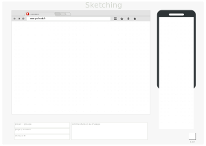
  • Prototyping – development of wire-frames, either in the form of paper prototypes or simple interactive screens. These prototypes are stripped of all look & feel elements and most content in order to concentrate on the interface.
  • Usability inspection – letting an evaluator inspect a user interface. This is generally considered to be cheaper to implement than usability testing (see step below), and can be used early on in the development process since it can be used to evaluate prototypes or specifications for the system, which usually cannot be tested on users. Some common usability inspection methods include cognitive walkthrough, which focuses the simplicity to accomplish tasks with the system for new users, heuristic evaluation, in which a set of heuristics are used to identify usability problems in the UI design, and pluralistic walkthrough, in which a selected group of people step through a task scenario and discuss usability issues.
  • Usability testing – testing of the prototypes on an actual user—often using a technique called think aloud protocol where you ask the user to talk about their thoughts during the experience. User interface design testing allows the designer to understand the reception of the design from the viewer's standpoint, and thus facilitates creating successful applications.
  • Graphical user interface design – actual look and feel design of the final graphical user interface (GUI). It may be based on the findings developed during the user research, and refined to fix any usability problems found through the results of testing.[4]Depending on the type of interface being created, this process typically involves some computer programming in order to validate forms, establish links or perform a desired action.[5]
  • Software Maintenance - After the deployment of a new interface, occasional maintenance may be required to fix software bugs, change features, or completely upgrade the system. Once a decision is made to upgrade the interface, the legacy system will undergo another version of the design process, and will begin to repeat the stages of the interface life cycle.[6]

Requirements[edit]

The dynamic characteristics of a system are described in terms of the dialogue requirements contained in seven principles of part 10 of the ergonomics standard, the ISO 9241. This standard establishes a framework of ergonomic "principles" for the dialogue techniques with high-level definitions and illustrative applications and examples of the principles. The principles of the dialogue represent the dynamic aspects of the interface and can be mostly regarded as the "feel" of the interface. The seven dialogue principles are:
  • Suitability for the task: the dialogue is suitable for a task when it supports the user in the effective and efficient completion of the task.
  • Self-descriptiveness: the dialogue is self-descriptive when each dialogue step is immediately comprehensible through feedback from the system or is explained to the user on request.
  • Controllability: the dialogue is controllable when the user is able to initiate and control the direction and pace of the interaction until the point at which the goal has been met.
  • Conformity with user expectations: the dialogue conforms with user expectations when it is consistent and corresponds to the user characteristics, such as task knowledge, education, experience, and to commonly accepted conventions.
  • Error tolerance: the dialogue is error tolerant if despite evident errors in input, the intended result may be achieved with either no or minimal action by the user.
  • Suitability for individualization: the dialogue is capable of individualization when the interface software can be modified to suit the task needs, individual preferences, and skills of the user.
  • Suitability for learning: the dialogue is suitable for learning when it supports and guides the user in learning to use the system.
The concept of usability is defined of the ISO 9241 standard by effectiveness, efficiency, and satisfaction of the user. Part 11 gives the following definition of usability:
  • Usability is measured by the extent to which the intended goals of use of the overall system are achieved (effectiveness).
  • The resources that have to be expended to achieve the intended goals (efficiency).
  • The extent to which the user finds the overall system acceptable (satisfaction).
Effectiveness, efficiency, and satisfaction can be seen as quality factors of usability. To evaluate these factors, they need to be decomposed into sub-factors, and finally, into usability measures.
The information presentation is described in Part 12 of the ISO 9241 standard for the organization of information (arrangement, alignment, grouping, labels, location), for the display of graphical objects, and for the coding of information (abbreviation, color, size, shape, visual cues) by seven attributes. The "attributes of presented information" represent the static aspects of the interface and can be generally regarded as the "look" of the interface. The attributes are detailed in the recommendations given in the standard. Each of the recommendations supports one or more of the seven attributes. The seven presentation attributes are:
  • Clarity: the information content is conveyed quickly and accurately.
  • Discriminability: the displayed information can be distinguished accurately.
  • Conciseness: users are not overloaded with extraneous information.
  • Consistency: a unique design, conformity with user's expectation.
  • Detectability: the user's attention is directed towards information required.
  • Legibility: information is easy to read.
  • Comprehensibility: the meaning is clearly understandable, unambiguous, interpretable, and recognizable.
The user guidance in Part 13 of the ISO 9241 standard describes that the user guidance information should be readily distinguishable from other displayed information and should be specific for the current context of use. User guidance can be given by the following five means:
  • Prompts indicating explicitly (specific prompts) or implicitly (generic prompts) that the system is available for input.
  • Feedback informing about the user's input timely, perceptible, and non-intrusive.
  • Status information indicating the continuing state of the application, the system's hardware and software components, and the user's activities.
  • Error management including error prevention, error correction, user support for error management, and error messages.
  • On-line help for system-initiated and user initiated requests with specific information for the current context of use.

Research

User interface design has been a topic of considerable research, including on its aesthetics.[7] Standards have been developed as far back as the 1980s for defining the usability of software products. One of the structural bases has become the IFIP user interface reference model. The model proposes four dimensions to structure the user interface:
  • The input/output dimension (the look)
  • The dialogue dimension (the feel)
  • The technical or functional dimension (the access to tools and services)
  • The organizational dimension (the communication and co-operation support)
This model has greatly influenced the development of the international standard ISO 9241 describing the interface design requirements for usability. The desire to understand application-specific UI issues early in software development, even as an application was being developed, led to research on GUI rapid prototyping tools that might offer convincing simulations of how an actual application might behave in production use.[8] Some of this research has shown that a wide variety of programming tasks for GUI-based software can, in fact, be specified through means other than writing program code.[9]
Research in recent years is strongly motivated by the increasing variety of devices that can, by virtue of Moore's law, host very complex interfaces.[10]
Research has also been conducted on generating user interfaces automatically, to match a user's level of ability for different levels of interaction.[11]
At the moment, in addition to traditional prototypes, the literature proposes new solutions, such as an experimental mixed prototype based on a configurable physical prototype that allow to achieve a complete sense of touch, thanks to the physical mock-up, and a realistic visual experience, thanks to the superimposition of the virtual interface on the physical prototype with Augmented Reality techniques

User interface design

User interface design (UI) or user interface engineering is the design of user interfaces for machines and software, such as computershome appliancesmobile devices, and other electronic devices, with the focus on maximizing usability and the user experience. The goal of user interface design is to make the user's interaction as simple and efficient as possible, in terms of accomplishing user goals (user-centered design).
Good user interface design facilitates finishing the task at hand without drawing unnecessary attention to itself. Graphic design and typography are utilized to support its usability, influencing how the user performs certain interactions and improving the aesthetic appeal of the design; design aesthetics may enhance or detract from the ability of users to use the functions of the interface.[1] The design process must balance technical functionality and visual elements (e.g., mental model) to create a system that is not only operational but also usable and adaptable to changing user needs.
Interface design is involved in a wide range of projects from computer systems, to cars, to commercial planes; all of these projects involve much of the same basic human interactions yet also require some unique skills and knowledge. As a result, designers tend to specialize in certain types of projects and have skills centered on their expertise, whether that be software design, user research, web design, or industrial design.

Dynamic websites

Dynamic websites are generated on the fly and use server-side technology to generate webpages. They typically extract their content from one or more back-end databases: some are database queries across a relational database to query a catalogue or to summarise numeric information, others may use a document database such as MongoDB or NoSQL to store larger units of content, such as blog posts or wiki articles.
In the design process, dynamic pages are often mocked-up or wireframed using static pages. The skillset needed to develop dynamic web pages is much broader than for a static pages, involving server-side and database coding as well as client-side interface design. Even medium-sized dynamic projects are thus almost always a team effort.
When dynamic web pages first developed, they were typically coded directly in languages such as PerlPHP or ASP. Some of these, notably PHP and ASP, used a 'template' approach where a server-side page resembled the structure of the completed client-side page and data was inserted into places defined by 'tags'. This was a quicker means of development than coding in a purely procedural coding language such as Perl.
Both of these approaches have now been supplanted for many websites by higher-level application-focused tools such as content management systems. These build on top of general purpose coding platforms and assume that a website exists to offer content according to one of several well recognised models, such as a time-sequenced blog, a thematic magazine or news site, a wiki or a user forum. These tools make the implementation of such a site very easy, and a purely organisational and design-based task, without requiring any coding.

Static websites


A static website stores a unique file for every page of a static website. Each time that page is requested, the same content is returned. This content is created once, during the design of the website. It is usually manually authored, although some sites use an automated creation process, similar to a dynamic website, whose results are stored long-term as completed pages. These automatically-created static sites became more popular around 2015, with generators such as Jekyll and Adobe Muse.[14]
The benefits of a static website are that they were simpler to host, as their server only needed to serve static content, not execute server-side scripts. This required less server administration and had less chance of exposing security holes. They could also serve pages more quickly, on low-cost server hardware. These advantage became less important as cheap web hosting expanded to also offer dynamic features, and virtual servers offered high performance for short intervals at low cost.
Almost all websites have some static content, as supporting assets such as images and stylesheets are usually static, even on a website with highly dynamic pages.

Web design (Tools and technologies)

Web design (Tools and technologies)
Web designers use a variety of different tools depending on what part of the production process they are involved in. These tools are updated over time by newer standards and software but the principles behind them remain the same. Web designers use both vector and raster graphics editors to create web-formatted imagery or design prototypes. Technologies used to create websites include W3C standards like HTML and CSS, which can be hand-coded or generated by WYSIWYG editing software. Other tools web designers might use include mark up validators and other testing tools for usability and accessibility to ensure their websites meet web accessibility guidelines.

Skills and techniques


User experience design and interactive design

User understanding of the content of a website often depends on user understanding of how the website works. This is part of the user experience design. User experience is related to layout, clear instructions and labeling on a website. How well a user understands how they can interact on a site may also depend on the interactive design of the site. If a user perceives the usefulness of the website, they are more likely to continue using it. Users who are skilled and well versed with website use may find a more distinctive, yet less intuitive or less user-friendly website interface useful nonetheless. However, users with less experience are less likely to see the advantages or usefulness of a less intuitive website interface. This drives the trend for a more universal user experience and ease of access to accommodate as many users as possible regardless of user skill.[10] Much of the user experience design and interactive design are considered in the user interface design.
Advanced interactive functions may require plug-ins if not advanced coding language skills. Choosing whether or not to use interactivity that requires plug-ins is a critical decision in user experience design. If the plug-in doesn't come pre-installed with most browsers, there's a risk that the user will have neither the know how or the patience to install a plug-in just to access the content. If the function requires advanced coding language skills, it may be too costly in either time or money to code compared to the amount of enhancement the function will add to the user experience. There's also a risk that advanced interactivity may be incompatible with older browsers or hardware configurations. Publishing a function that doesn't work reliably is potentially worse for the user experience than making no attempt. It depends on the target audience if it's likely to be needed or worth any risks.

Page layout

Part of the user interface design is affected by the quality of the page layout. For example, a designer may consider whether the site's page layout should remain consistent on different pages when designing the layout. Page pixel width may also be considered vital for aligning objects in the layout design. The most popular fixed-width websites generally have the same set width to match the current most popular browser window, at the current most popular screen resolution, on the current most popular monitor size. Most pages are also center-aligned for concerns of aesthetics on larger screens.
Fluid layouts increased in popularity around 2000 as an alternative to HTML-table-based layouts and grid-based design in both page layout design principle and in coding technique, but were very slow to be adopted.[note 1] This was due to considerations of screen reading devices and varying windows sizes which designers have no control over. Accordingly, a design may be broken down into units (sidebars, content blocks, embedded advertising areas, navigation areas) that are sent to the browser and which will be fitted into the display window by the browser, as best it can. As the browser does recognize the details of the reader's screen (window size, font size relative to window etc.) the browser can make user-specific layout adjustments to fluid layouts, but not fixed-width layouts. Although such a display may often change the relative position of major content units, sidebars may be displaced below body text rather than to the side of it. This is a more flexible display than a hard-coded grid-based layout that doesn't fit the device window. In particular, the relative position of content blocks may change while leaving the content within the block unaffected. This also minimizes the user's need to horizontally scroll the page.
Responsive Web Design is a newer approach, based on CSS3, and a deeper level of per-device specification within the page's stylesheet through an enhanced use of the CSS @media rule.